Develop - keyboard
As detailed on the user experience design keyboard topic, keyboard interaction may be the most critical step to increase the accessibility of a product. Every action a mouse user can do should have a keyboard equivalent. As more designers capture keyboard interaction in wireframes, developers can expect more explicit keyboard guidance. But developers must themselves become more familiar with conventional keyboard interaction. Most wireframing tools capable of outputting functional prototypes emphasize pointer interaction. Developers are usually the first team members who can experience how a design feels to a keyboard user. This is the reason keyboard testing is emphasized in unit testing.
 Level 1
Properly code the navigation order
What to do
For users to be able to interact using a keyboard, components must be included in the tab order (so that they take focus when a user navigates a page with the Tab key). Wireframes should indicate to developers both what elements take focus, and in what order. They may also indicate interaction when navigation takes place within a complex widget (usually using arrow keys). Where wireframes do not provide clarity on keyboard navigation, discuss with the design team.
The code techniques for including elements in the tab order vary depending on the source of the component:
Standard HTML. Interactive HTML elements are automatically added to the tab order, based on placement in the Document Object Model (DOM), with no further effort by the developer.
Components from a code framework. Check the documentation and perform a keyboard test to ensure each supports tab navigation.
Custom elements. Depending on usage, either:
- Use
tabindex=”0”to add a focusable element naturally into the tab order, according to its placement in the DOM. - Use
tabindex=”-1”to remove the element from the initial tab order. Then make it focusable usingelement.focus()for dynamic elements such as dialog.
- Use
<!-- Set tab order according to DOM --><div tabindex="0">Div with tabindex set to 0, 1st tab stop</div><div>Div with no tabindex, *NO* tab stop</div><button type="button">Button, 2nd tab stop</button><a href="pretend_target.html">Link, 3rd tab stop</a><div tabindex="0">Div with tabindex set to 0, 4th tab stop</div>Techniques
- G59: Placing the interactive elements in an order that follows sequences and relationships within the content
- SCR26: Inserting dynamic content into the Document Object Model immediately following its trigger element
- SCR37: Creating Custom Dialogs in a Device Independent Way
Requirements and resources
- 2.1.1 Keyboard, IBM accessibility requirements
- 2.4.3 Focus Order, IBM accessibility requirements
- Keyboard-navigable javascript widgets, Mozilla Developer Network
- Managing focus in composite widgets, ARIA authoring practices
Related toolkit topics
- Keyboard interaction, UX design - Keyboard interaction
What to do
Correctly ordering content in the Document Object Model (DOM) is the preferred way to achieve a focus order. The order can also be adjusted programmatically, but there are accessibility considerations with most of the techniques.
When dynamic content is inserted, you must take care to insert the content in the correct place in the DOM to maintain a logical tab order.
Ensure that when a dialog appears because of a user action, focus is set on an interactive element within it. When the dialog is dismissed, return the focus to a logical place, typically the element that caused the dialog to appear. Consult with the UX designer to ensure smooth transitions of focus.
Use caution setting the
tabindexattribute on elements to a number greater than zero, which causes them to receive focus before focusable elements that lacktabindexor havetabindex="0". After all the elements with atabindexgreater than zero have received focus, the rest of the elements receive focus in the order they appear in the DOM.<!-- Set tab order according to DOM --><div tabindex="0">This is 1st tab stop</div><div tabindex="0">This is 2nd tab stop</div><div tabindex="-1" role="dialog" aria-modal="true"aria-label="This won’t be in tab order after second div until set by script">...</div><div tabindex="0">This is 3rd tab stop</div></div>Techniques
- G59: Placing the interactive elements in an order that follows sequences and relationships within the content
- C27: Making the DOM order match the visual order
- SCR27: Reordering page sections using the Document Object Model
Requirements and resources
- 2.4.3 Focus Order, IBM accessibility requirements
- DOM order matters, Google
- Why using `tabindex` values greater than “0” is bad, KarlGroves.com
Related toolkit topics
- Keyboard interaction, UX design - Keyboard interaction
What to do
When an object takes keyboard focus, it must visually display a focus indicator. By default, interactive HTML elements will receive a focus indicator from the browser. Any time the design calls for an override of the default focus indicator, implement a replacement focus indicator that is highly visible, as per the design.
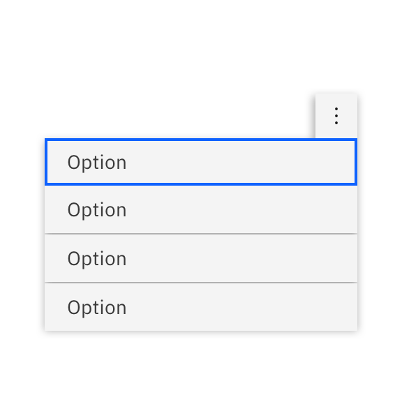
Ensure focus is highly visible, if it's not the default indicator, so that users know where the keyboard focus is.
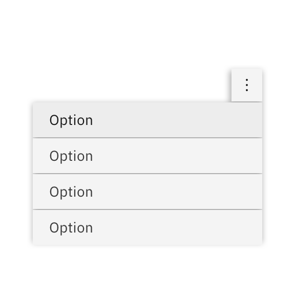
Don't use insufficient contrast, such as this slight variance in background color, which makes it difficult for users to know where the keyboard focus it.
The following practices remove the focus indicator and need remediation or a replacement focus indicator controlled by scripting:
- CSS style
outline:0 - CSS style
outline:none onfocus="blur"This should be avoided because the keyboard user cannot interact with the element.
The following resolves a missing focus indicator by using the CSS property
outline(here adding a really obvious thick, dotted red line!), and also adds some space between the elements and indicator with use of the CSS propertyoutline-offset./* The following resolves missing focus indicator by use of CSS properties outline and outline-offset */*:focus {outline: 2px dashed red;outline-offset: 2px;}Techniques
- G195: Using an author-supplied, highly visible focus indicator
- C15: Using CSS to change the presentation of a user interface component when it receives focus
- C40: Creating a two-color focus indicator to ensure sufficient contrast with all components
- SCR31: Using script to change the background color or border of the element with focus
- F78: Failure of Success Criterion 2.4.7 due to styling element outlines and borders in a way that removes or renders non-visible the visual focus indicator
Requirements and resources
- 2.4.7 Focus Visible, IBM accessibility requirements
- Design patterns and widgets, ARIA authoring practices
Related toolkit topics
- Component contrast, Visual design - Component contrast
- CSS style
Ensure interactive elements are reachable with the keyboard
Where possible, achieve the desired tab order by adjusting the DOM, rather than overriding the tabindex
When overriding the default focus indicator, confirm focus is highly visible
Implement established keyboard conventions
What to do
Standard HTML elements are built with full keyboard operability. The keys used to operate HTML elements are predictable, and consistent with keys used to operate native operating system elements of the same type. Use of HTML elements reduces the work for a developer because the browser handles the keyboard functionality for the element.
If the design shows a certain visual treatment for an HTML element, override the default browser styling and use CSS to change its appearance.
<!DOCTYPE html><html><head><style>input[type=text] {width: 100%;padding: 12px 18px;margin: 8px 0;box-sizing: border-box;Techniques
- C15: Using CSS to change the presentation of a user interface component when it receives focus
- H91: Using HTML form controls and links
Requirements and resources
- 2.1.1 Keyboard, IBM accessibility requirements
- HTML: A good basis for accessibility, Mozilla Developer Network
Related toolkit topics
- Keyboard interaction, UX design - Keyboard
What to do
Standard HTML elements already have well thought out keyboard functionality built in. The keyboard operation closely models what works for similar components in desktop operating systems, making navigation and usage predictable for the user.
However, there are many operating system components that don’t exist natively in HTML, such as menus and sliders. Accessible Rich Internet Application (ARIA) markup was created so developers can build custom components that consistently work with assistive technologies. Implement keyboard handlers using established conventions to give full keyboard access to the functionality of the component. For predictable usage via a keyboard, it is best to implement keyboard access consistent with the patterns found in the ARIA authoring practices.
Be cautious when using a code framework or design system with custom-built components and patterns. Many frameworks were not built or maintained with accessibility in mind. Check the documentation and verify keyboard operability of all functionality. Any time the keyboard operation of a custom component departs from convention, discuss the reasons and risks with design.
Requirements and resources
- 2.1.1 Keyboard, IBM accessibility requirements
- Standard keystrokes, WebAIM
- Design patterns and widgets, ARIA authoring practices
Related toolkit topics
- Confirm component keyboard interaction, Develop - Unit testing
- Keyboard interaction, UX design - Keyboard
What to do
Once the keyboard operation is fully defined, use ARIA techniques to implement any custom components. When using a UI component library, use only components that have a full implementation of keyboard access. For all other components, use the ARIA authoring practices and examples to guide keyboard implementation. Remember that although you can assign roles through ARIA, you still need to implement all keyboard interaction using events like
onkeydown.Wireframes may specify where navigation has been improved by grouping controls to reduce tabbing. This is most common in composite components, such as navigation trees and toolbars where the
tabindexattribute andaria-activedecendentproperty can be used to manage navigation within a component. The ARIA authoring practices provide keyboard operation guidance, as well as working examples where you can examine coding techniques.Techniques
- SCR20: Using both keyboard and other device-specific functions
- SCR35: Making actions keyboard accessible by using the onclick event of anchors and buttons
Requirements and resources
- 2.1.1 Keyboard, IBM accessibility requirements
- Keyboard-navigable javascript widgets, Mozilla Developer Network
- Developing a keyboard interface, ARIA authoring practices
- Keyboard navigation inside components, ARIA authoring practices
- Design patterns and widgets, ARIA authoring practices
Related toolkit topics
- Confirm component keyboard interaction, Develop - Unit testing
- Keyboard interaction, UX design - Keyboard
Use standard HTML elements where possible, using CSS to alter appearance not behavior
Be familiar with established keyboard conventions
Implement keyboard operation for custom elements
 Level 2
Ensure keyboard access to complex interactions
What to do
People who are blind do not use a mouse to interact with media players, which means all of the player’s features must be keyboard accessible. If the content designer obtains a video for use with a specific embedded player, the keyboard accessibility should have already been verified and you won’t need to do anything other than embed the multimedia.
If you create your own media player using the HTML media API, the design should provide the keyboard shortcuts. Implement full keyboard operability of the applicable features of the player:
- Play and pause
- Volume control
- Screen size and exiting from full-screen
- Closed caption settings
- Subtitle and audio description settings
- Advancing and rewinding
- Any other available player features and settings
Be sure to unit test your implementation to ensure all functions are keyboard operable and the visual focus indicator is visible for all of the player’s controls.
Techniques
- SCR2: Using redundant keyboard and mouse event handlers
- SCR20: Using both keyboard and other device-specific functions
- SCR35: Making actions keyboard accessible by using the onclick event of anchors and buttons
Requirements and resources
- 2.1.1 Keyboard, IBM accessibility requirements
- 2.1.2 No Keyboard Trap, IBM accessibility requirements
- Muted autoplay on mobile: Say goodbye to canvas hacks and animated GIFs!, Google developers
- Accessible multimedia, Mozilla Developer Network
- Test your skills: Multimedia and embedding, Mozilla Developer Network
Related toolkit topics
- Embed multimedia content that supports closed captions, Develop – Non-text content
- Media players, UX design – Media players
- Test with a keyboard, Verify - Manual
What to do
Keyboard operation can be affected if items that take focus are not visible in the viewport. Temporary or secondary information such as banners, overlays, and pop-ups should be implemented so they do not potentially obscure items receiving keyboard focus.
Techniques
- C43: Using CSS margin and scroll-margin to un-obscure content, WCAG 2.2 technique, WCAG 2.2 technique
- F110: Failure of Success Criterion 2.4.11 Focus Not Obscured (Minimum) due to a sticky footer or header completely hiding focused elements, WCAG 2.2 technique
Requirements and resources
- 2.4.11 Focus Not Obscured (Minimum), IBM accessibility requirements (WCAG 2.2 only)
Related toolkit topics
- Pop-ups and overlays, Design - UX
Make custom media player and animation controls keyboard accessible
Keep item receiving focus visible (WCAG 2.2 only)
 Level 3
Code screen updates predictably
What to do
When users move keyboard focus to an element, they don’t expect major content updates to occur or forms to be submitted. For someone who cannot see, such unexpected events can be especially disorienting. Context changes such as this should be triggered through an
activateevent rather than afocusevent.Techniques
- G107: Using "activate" rather than "focus" as a trigger for changes of context
- F55: Failure of Success Criteria 2.1.1, 2.4.7, and 3.2.1 due to using script to remove focus when focus is received
Requirements and resources
- 3.2.1 On Focus, IBM accessibility requirements
What to do
Changing the context or focus when a user makes a selection or types input in a field is unexpected behavior and disorients users. This is especially true when the user has a vision disability, and cannot see what happened. You can update content of other elements on the page based on a user’s selection, but avoid automatically changing focus at the same time. One way to do this is to use an
onchangeevent to trigger updating content based on the user’s action, such as making a selection. Another way is to incorporate a Submit button that provides an overt action where the user would expect a focus change.Techniques
- SCR19: Using an onchange event on a select element without causing a change of context, WCAG 2.1 technique
- H32: Providing submit buttons, WCAG 2.1 technique
- H84: Using a button with a select element to perform an action, WCAG 2.1 technique
Requirements and resources
- 3.2.2 On Input, IBM accessibility requirements
- Understanding 3.2.2 On Input, WCAG