Design
Make sure the visual layout and formatting are distinct.
 Level 1 - core
Users with low vision need sufficient contrast in order to read. The color contrast ratio follows a formula to compare the luminance of the foreground text with background colors. Take note of contrast especially for text resizing, responsive design, and motion effects (where parallax effects during scrolling or animated backgrounds) when the position of text on its background can change.
What to do
- Make sure text achieves sufficient contrast against its background
- Achieve minimum contrast for all text placed over images or gradients

Minimum contrast for body text (less than 18 point regular or 14 point bold) is 4.5:1.

Don’t use text below 4.5:1 contrast that makes it difficult to read.

Minimum contrast for large text (greater than 18 point regular or 14 point bold) is 3:1.

Don't use large text that contrasts less than 3:1 with its background.

Maintain a minimum contrast ratio for all text placed over an image. Copyright IBM; all rights reserved.

Don't place text on a background that falls below contrast minimums at any point.
Resources
- F83: Failure of Success Criterion 1.4.3 and 1.4.6 due to using background images that do not provide sufficient contrast with foreground text (or images of text), WCAG 2.1 technique
- Ensure high contrast over text images, Nielsen Norman Group
- Color with good contrast, W3C web accessibility perspectives
- Color themes and accessibility, Carbon design system
- Color contrast checker, Paciello Group
- Stark plugin for color contrast, Stark
- Text on background image a11y check, Brandwood
Requirements
- 1.4.3 Contrast (Minimum), IBM accessibility requirements
Related toolkit topics
- Link text contrast, this page
Users need to easily identify links in content. Removing the underline or not having enough visual contrast with the surrounding text will decrease the discoverability, especially for users with low vision or cognitive disabilities.
What to do
- Confirm link text is underlined and/or contrasts 3:1 with surrounding text. Achieving both is optimal.
- Make sure an underline persists on pointer hover and keyboard focus
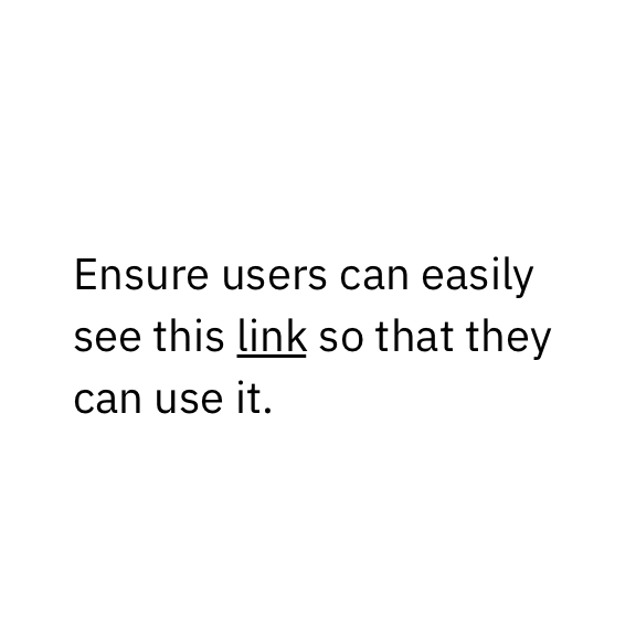
Underlining link text is an easy way to help users identify links in content.

If the underline is removed, have link text contrast at least 3:1 with its surrounding text.

Don't remove underlines from link text without sufficiently contrasting with surrounding text (3:1) and the background (4.5:1)
Resources
- Guidelines for visualizing links, Nielsen Norman Group
- How to use underline text to improve UX, Adobe®
- Link usage, Carbon design system
Requirements
- 1.4.1 Use of color, IBM accessibility requirements
Related toolkit topics
- Text styles, this page
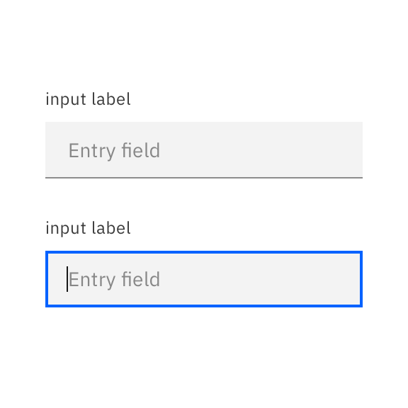
Users with low vision need sufficient contrast for the visual information needed to identify and operate components. Exceptions that don’t need to meet contrast requirements include: disabled components that users can’t interact with, and unmodified standard HTML elements.
What to do
- Make sure text label meets 4.5:1 contrast on its background
- Make sure input fields meet 3:1 contrast
- Make sure elements needed to identify and operate components meet 3:1 contrast
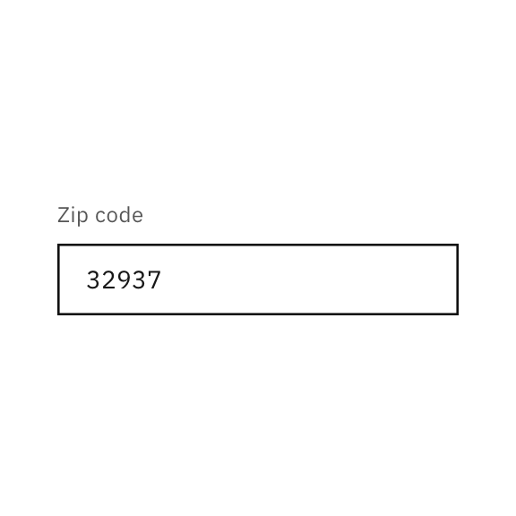
The input field has a bounding box that meets 3:1 contrast with its background.
At a minimum, the bottom of the input region must meet 3:1 contrast with its background.
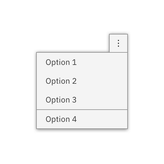
This overflow menu has a clear outline around it, as well as distinct dividers between grouped items.
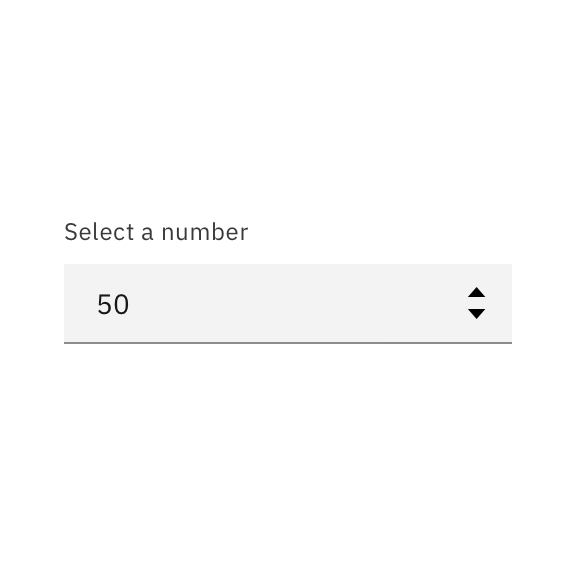
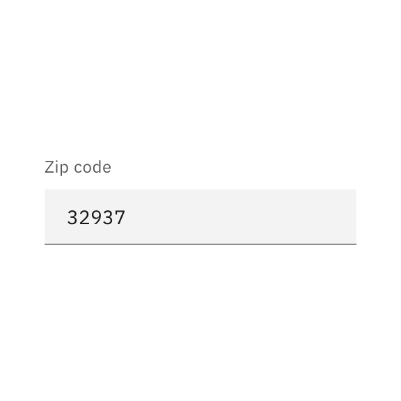
The increments for this spin button achieve 3:1, as does the darker gray underline for the input boundary, not achieved by the light gray rectangle.
Resources
- G209: Provide sufficient contrast at the boundaries between adjoining colors, WCAG 2.1 technique
- Active user interface component examples, WCAG
- Colour contrast for user interface components, Accessibility Developer Guide
- Contrasting UI components: passing the new standards, Medium
- Text input, Carbon design system
- The importance of contrast in interface design, Matthew Morek
- Understanding 1.4.11 Non-text Contrast, WCAG
Requirements
- 1.4.11 Non-text Contrast, IBM accessibility requirements
Related toolkit topics
- Tooltips and overlays, this page
Users with low vision need sufficient contrast to perceive the different visual states of a component, such as focused, selected, hovered, pressed, expanded, or checked. Visual treatments to indicate state changes may just be a difference of color (such as a button changing hue). Others will involve altering the size or opacity of all or part of a component. Note that every state does not need to contrast with every other state 3:1 (although the more distinguishable, the better).
What to do
- Make sure visual states for components meet 3:1 contrast with adjacent colors
- Make sure focus and non-focus states meet contrast requirements
Ensure various states, such as selected and unselected, have good contrast.
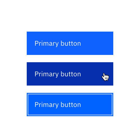
The visual treatment for the enabled, hover, active, and focus states of buttons have at least a 3:1 color contrast ratio against the background.
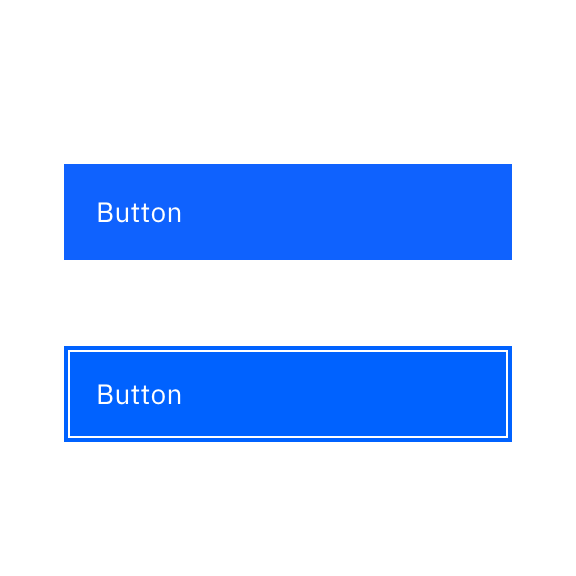
Use strokes that are at least 2px thick for focus indicators that work well in light or dark mode.
Maintain at least 3:1 color contrast between the focus indicator and its adjacent color and between the focused and unfocused states of the component.
Resources
- G165: Using the default focus indicator for the platform so that high visibility default focus indicators will carry over, WCAG 2.1 technique
- G195: Using an author-supplied, highly visible focus indicator, WCAG 2.1 technique
- Accessible focus indicators, Deque
- Contrasting UI components: passing the new standards, Medium
- Understanding 1.4.11 Non-text Contrast, WCAG
Requirements
- 1.4.11 Non-text Contrast, IBM accessibility requirements
- 2.4.7 Focus Visible, IBM accessibility requirements
Related toolkit topics
- Keyboard interaction, UX design
- When overriding the default focus indicator, confirm focus is highly visible, Develop – Keyboard interactions
Users with low vision and color blindness need sufficient contrast to see icons more easily. Exceptions that don’t need to meet contrast requirements include: disabled icons that users can’t interact with.
What to do
- Make sure icons meet 3:1 contrast with its background

Have icons with a contrast of at least 3:1. Copyright IBM; all rights reserved.

Don't have icons with a contrast lower than 3:1. Copyright IBM; all rights reserved.
Resources
- G207: Ensuring that a contrast ratio of 3:1 is provided for icons, WCAG 2.1 technique
- Icon usage, Carbon design system
Requirements
- 1.4.11 Non-text Contrast, IBM accessibility requirements
Related toolkit topics
- Component contrast, this page
- Visual states, this page
- Alternative text for visuals, Content design
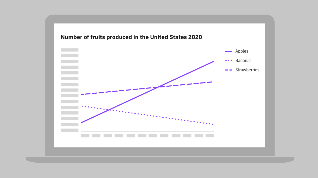
Users with low vision and color blindness need sufficient contrast to distinguish the different parts of charts and graphs in order to understand the data displayed. This is achieved by having sufficient contrast against adjoining colors and its background. Data segments that use non-color treatments such as texture and shape for distinction don’t need to contrast with adjoining colors.
What to do
- Make sure data representations in charts meet 3:1 contrast with the background
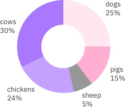
With the use of labels that include key data, it's not necessary for adjoining colors to have 3:1 color contrast.

Don't use colors below 3:1 color contrast against background or adjoining colors for charts that don't have labels.

Charts without labels must have a 3:1 color contrast with the background as well as adjoining colors.

Don't use colors that fall below 3:1 color contrast, such as the pink segment, for charts without labels.
Resources
- G209: Provide sufficient contrast at the boundaries between adjoining colors, WCAG 2.1 technique
- Data visualization, Carbon design system
- Understanding 1.4.11 Non-text Contrast, WCAG
Requirements
- 1.4.11 Non-text Contrast, IBM accessibility requirements
Related toolkit topics
- Component contrast, this page
- Visual states, this page
Users with low vision will often scale content up to 400% (and beyond) using browser zoom features to make pages easier to read. Without responsive reflow, users will have to scroll horizontally, causing them to lose their place. Although horizontal scrolling is allowed for specific usage such as maps, tables, and diagrams, it’s possible to design such content to reflow gracefully as well.
What to do
- Reflow content without horizontal scrolling
- If responsive design isn’t supported, provide a design option at 256 pixels wide

Use responsive design so that as the user scales up the zoom level, the content adjusts its placement and reflow.

Don't cut off content that will require the user to scroll both horizontally and vertically to read information.
Resources
- C28: Specifying the size of text containers using em units, WCAG 2.1 technique
- C35: Allowing for text spacing without wrapping, WCAG 2.1 technique
- C36: Allowing for text spacing override, WCAG 2.1 technique
- F104: Failure of Success Criterion 1.4.12 due to clipped or overlapped content when text spacing is adjusted, WCAG 2.1 technique
- Header base with side navigation, Carbon design system
Requirements
- 1.4.10 Reflow, IBM accessibility requirements
- 1.4.12 Text Spacing, IBM accessibility requirements
Required fields include two considerations: how to mark each required field, and how to show what the marks indicate.
What to do
- Include “(required)” in the input label to indicate required fields
- If using symbols to indicate required fields, include in label and provide a legend
- If flagging optional instead of required fields, provide a legend for clarity
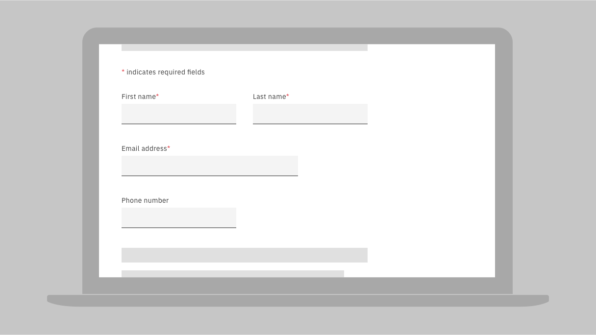
Indicate required fields in an accessible way, such as including a red asterisk in the label. Be sure to provide a legend as well to explain the asterisk's meaning.
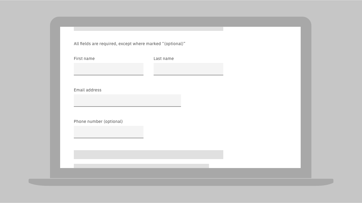
When only optional fields are labeled, provide a legend that says 'all fields are required, except where marked 'optional'.
Resources
- H90: Indicating required form controls using label or legend, WCAG 2.1 technique
- G131: Providing descriptive labels, WCAG 2.1 technique
- G184: Providing text instructions at the beginning of a form or set of fields that describes the necessary input, WCAG 2.1 technique
- Form fields - required vs. optional, UX Collective
- Marking required fields in forms, Nielsen Norman Group
Requirements
- 1.3.1 Info and Relationships, IBM accessibility requirements
- 3.3.2 Labels or Instructions, IBM accessibility requirements
Related toolkit topics
- Programmatically associate inputs with labels, Develop - User guidance
Text color contrast
Link text contrast
Component contrast
Visual states
Icons
Data visualization
Responsive reflow
Required fields
 Level 2 - continued
Question the purpose of text styled differently than body text. Larger point-sized text or standalone sentence fragments in bold are probably serving as headings. If such text is reduced to body text and the usability of the page is reduced, it should be annotated as a heading.
What to do
- Consider headings in place of bold sentence fragments and larger-sized text
- Avoid underlying anything except interactive text to reduce confusion
Resources
- Accessible emphasis: using italics instead of underlines, Montana State University™
- Bold and italic formatting in HTML, Penn State® accessibility
- Headings, W3C web accessibility tutorials
- Link appearance, WebAIM
- Text block formatting, Penn State accessibility
Requirements
- 1.3.1 Info and Relationships, IBM accessibility requirements
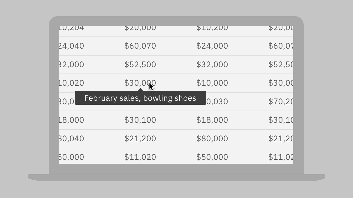
Users who have low vision or colorblindness need additional visual cues that don’t rely solely on color to distinguish the data points on a complex graph. Consider additional cues to link data points to their corresponding legend text.
What to do
- Don’t rely on non-contrasting colors alone to match data points to legend text
- Don’t rely on color alone to indicate status or errors
You can use pattern or shape variations when colors do not sufficiently contrast.
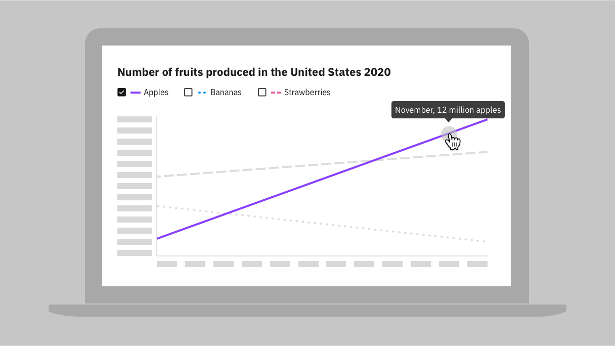
Consider interaction to help distinguish data points. Here the legend allows filtering; as well, users can reveal chart data points.
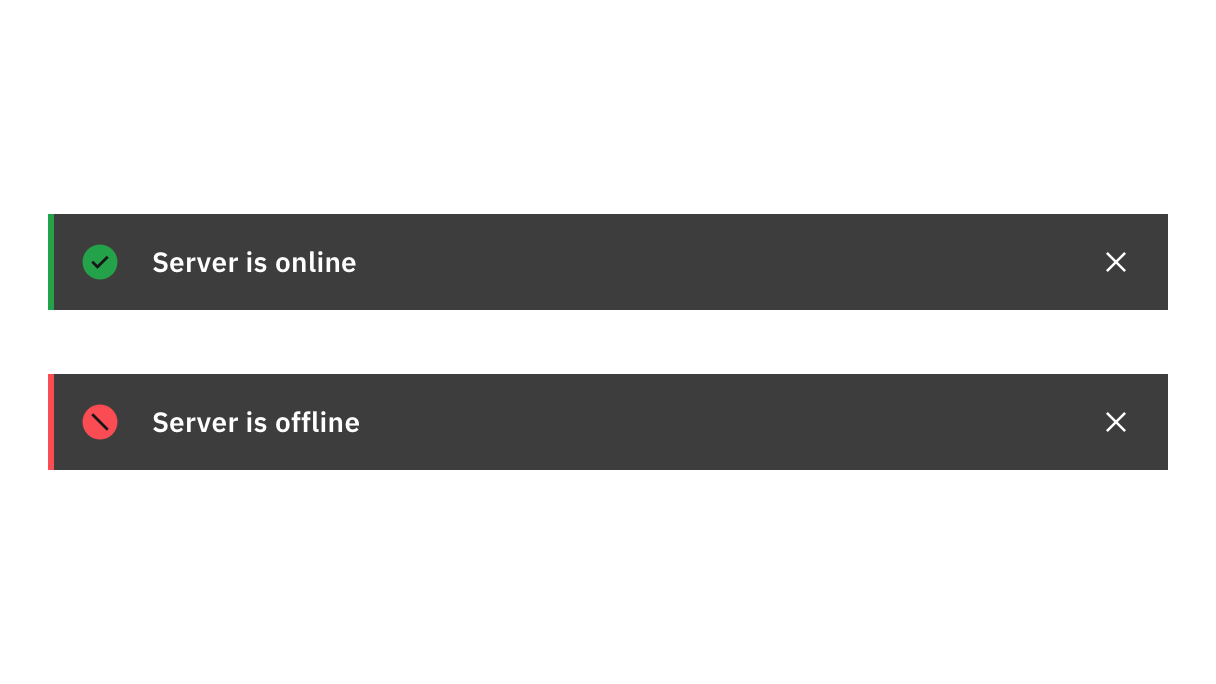
In addition to the use of green and red, icons are used to distinguish status.
Resources
- G14: Ensuring that information conveyed by color differences is also available in text, WCAG 2.1 technique
- G111: Using color and pattern, WCAG 2.1 technique
- G182: Ensuring that additional visual cues are available when text color differences are used to convey information, WCAG 2.1 technique
- G183: Using a contrast ratio of 3:1 with surrounding text and providing additional visual cues on hover for links or controls where color alone is used to identify them, WCAG 2.1 technique
- G205: Including a text cue for colored form control labels, WCAG 2.1 technique
Requirements
- 1.4.1 Use of color, IBM accessibility requirements
Related toolkit topics
- Component contrast, this page
- Visual states, this page
- Data visualization, this page
- Surfacing error messages, UX design
Users with low vision need new content added to the screen to be visually separated from existing content, especially when new text is overlaid on other content and the background colors are the same. This prevents dialogs and popups from blending in with the information behind them.
What to do
- Make sure tooltips and overlays are visually distinct from other content
- Make sure borders of tooltips and overlays meet 3:1 contrast with its background
Resources
- G209: Provide sufficient contrast at the boundaries between adjoining colors, WCAG 2.1 technique
- Instructional overlays and coach marks for mobile apps, Nielsen Norman Group
Requirements
- 1.4.11 Non-text Contrast, IBM accessibility requirements
Related toolkit topics
- Component contrast, this page
- Visual states, this page
- Feedback and notifications, UX design
- Make content accessible that appears on hover or focus, Develop - Dynamic content
Users with disabilities may have a need or preference to view content on their device in a certain orientation. A device may be mounted on a wheelchair in a set position. Users with low vision often orient their screen horizontally and use large fonts or screen magnification to read content more easily.
What to do
- Provide layouts for both landscape and portrait orientations

Design layouts for both landscape and portrait orientations.
Resources
- Designing for device orientation: from portrait to landscape, Smashing magazine
- Mobile app design: screen sizes and rotation for better UX, noeticforce
- Responsive design: rotating your device, Appstudio blog
- Which way is up? Orientation in WCAG 2.1, Intopia
Requirements
- 1.3.4 Orientation, IBM accessibility requirements
Related toolkit topics
- Responsive reflow, this page
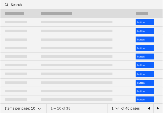
Data tables can be a nightmare for users who are blind and rely on both keyboard and screen readers to navigate a page. Users with low vision who zoom in to navigate a page can also easily get lost in navigating complex tables. Designers can help to reduce keyboard effort, provide proper information for screen readers, and offer visual cues for users with low vision.
What to do
- Use pagination and filters to reduce amount of data
- If multiple actions per row, consider grids to reduce keyboard effort
- Considering exposing cell’s header information for users with low vision
- Annotate cells that serve as row or column headers
Reduce keyboard navigation by having one action per row, or consider alternatives.
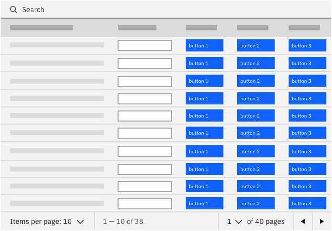
Avoid making keyboard operation impenetrable by forcing users to tab through many cells per row. Consider a grid with arrow navigation.
Provide a way (such as using a tooltip) for users to discover their context when a cell's header information is not in view.
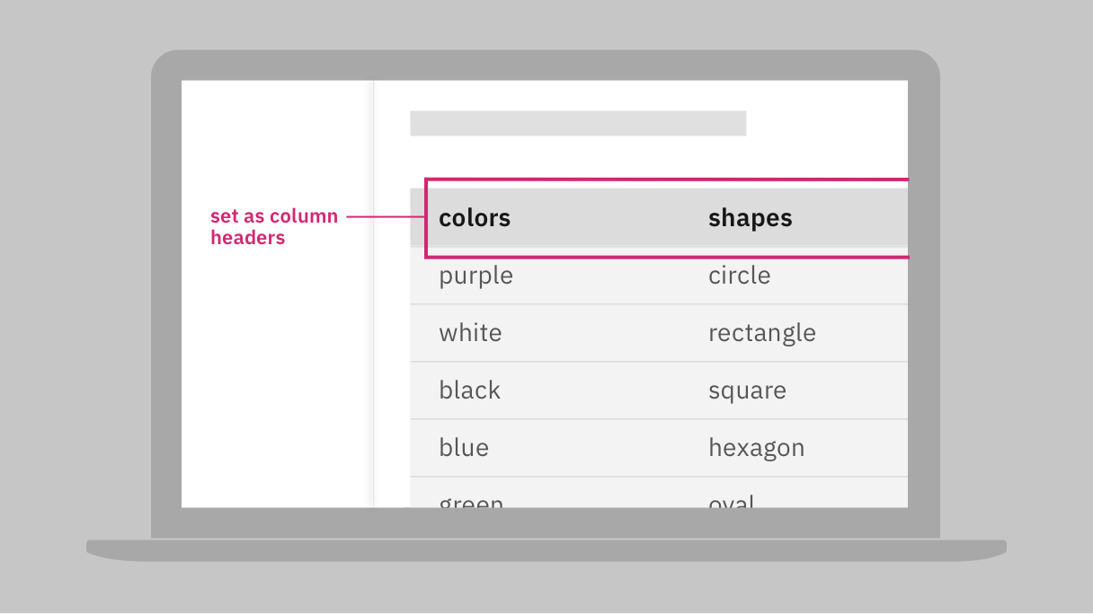
Annotate any row or column headers in your wireframes.
Resources
- ARIA9: Using aria-labelledby to concatenate a label from several text nodes, WCAG 2.1 technique
- H43: Using id and headers attributes to associate data cells with header cells in data tables, WCAG 2.1 technique
- H65: Using the title attribute to identify form controls when the label element cannot be used, WCAG 2.1 technique
- Accessible pagination, a11ymatters
- Filtering, Carbon design system
- Grids: Interactive tabular data and layout containers, ARIA authoring practices
- Infinite scroll & accessibility! Is it any good?, Digital a11y
- Pagination navigation, A11Y style guide
- Pagination usage, Carbon design system
- Table concepts, W3C web accessibility tutorials
- Tables with one header, W3C web accessibility tutorials
- Tables with two headers, W3C web accessibility tutorials
- Tables with irregular headers, W3C web accessibility tutorials
- Tables with multi-level headers, W3C web accessibility tutorials
- 1.3.1 Info and Relationships, IBM accessibility requirements
Related toolkit topics
- Keyboard interaction, UX design
- Hover content, UX design
Text styles
Legends
Tooltips and overlays
Layout orientations
Data tables
 Level 3 - complete
Users who are blind rely on keyboard and screen readers to navigate a page. One way to improve keyboard navigation is to designate regions on the page for implementation so that such users can navigate regions faster.
What to do
- Designate appropriate regions, especially header, main and footer
Resources
- Page regions, W3C web accessibility tutorials
Requirements
- 1.3.1 Info and Relationships, IBM accessibility requirements
- 2.4.1 Bypass Blocks, IBM accessibility requirements
- 4.1.2 Name, Role, Value, IBM accessibility requirements
Users who are blind rely on keyboard and screen readers to navigate a page. Related input elements that are visually indicated as a group are implemented by development to inform screen readers of their relationship. This means that users who cannot see the groups can experience them through the information the assistive technology announces aloud. Examples of such groups are a shipping address (made up of several input fields), radio buttons, and checkboxes.
What to do
- Designate forms and annotate any grouping of inputs
Resources
- Form accessibility, Carbon design system
- Grouping controls, W3C web accessibility tutorials
Requirements
- 1.3.1 Info and Relationships, IBM accessibility requirements
- 3.3.2 Labels or Instructions, IBM accessibility requirements
Designs use white space to provide visual separation between groupings of content. Analyze the visual design to find where there may be meaning, relationships, or organization introduced through the use of white space. The other topics in this section show where specific meaning should be noted in the design that a developer can code for improved accessibility.
What to do
- Analyze white space for possible accessibility considerations
Requirements
- 1.3.1 Info and Relationships, IBM accessibility requirements
- 4.1.2 Name, Role, Value, IBM accessibility requirements